
Artillery
TUFENKIAN FINE ARTS
Sigrid Burton
by John David O’Brien
March 18, 2020
The adventure of color in these paintings creates a wild conundrum for writing in that color is absolutely palpable in terms of its sensation and feeling, yet is nearly ineffable in terms of being translated into words. These paintings structure a wonderfully acrobatic experience for a viewer’s mind as they literally dance between the color fields and the different types of mark-making and the different types of color extension to its amazingly inconclusive sense of wordless appreciation. Not inconclusive in the sense that it doesn’t have sense. It just doesn’t have linguistic translations adequate to the experience and as a result, the perception of a viewer travels off into a dot…of musing.
Throughout the larger fields of radiant and vibrant color, there are smaller marks. Some look akin to calligraphic doodles or the vapor trails of things arcing through space. Others have the semblance of a willfully disarticulated object, possibly obscured in part but with details emerging the way objects would stand out from a pool of clouded water. Overall the sensations of a microcosmic or macrocosmic perspective are equally balanced. This could be something that is happening out of sight because it is too small to see or too far away to be seen. In either case, the artist has brought it to us as something to contemplate, savor and delve into.
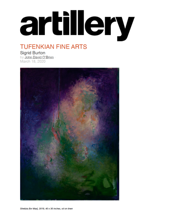
The painting Strelitzia (for Max), 2019 may well be named for the small genus of usually large African herbs that includes the bird-of-paradise flower but that resemblance is as distance as Max. The primarily blue and red combinations of color out of which large swaths of green and beige emerge are unlike anything we would see in nature or the world around us. It is the frothy spinning of the mark-making that wends its way into a calligraphic twirl accentuated by a pendulum-like element cutting down from the top of the vertical plane that catches our eye. The suggestion is of a multitude of inspirations that happily forgo resembling anything specific.
In How Memory Remains (for Bob Pauls), 2019, the color scheme is entrusted to the extraordinary volatility of yellows mixed with reds verging on oranges and multiple kinds of beige. Somewhere from within the swirl coming up from the lower right a light blue turns into a darker set of almost synaptic traces. Larger quasi-letterforms emerge and some elements resembling shell-like protrusions emerge from the color below. A viewer is encouraged to sift through the colliding colors, yearning both to complete the equations and the same time enjoying how unhinged the color is from any representational constraints. Sigrid Burton revels in the play of color and toys with how we all strive to turn it into something other than just pure light while relishing how that light entrances and conveys beyond words.