
Lyrical Color
Art & Antiques Magazine, Jason Edward Kaufman
February 2003
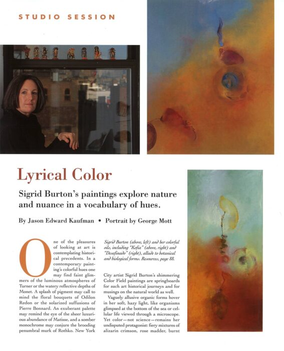
Sigrid Burton’s paintings explore nature and nuance in a vocabulary of hues.
One of the pleasures of looking at art is contemplating historical precedents. In a contemporary painting’s colorful hues one may find faint glimmers of the luminous atmospheres of Turner or the water reflective depths of Monet. A splash of pigment may call to mind the floral bouquets of Odilon Redon or the solarized suffusions of Pierre Bonnard. An exuberant palette may remind the eye of the sheer luxurious abundance of Matisse, and a somber monochrome may conjure the brooding penumbral murk of Rothko. New York City artist Sigrid Burton’s shimmering Color Field paintings are springboards for such art historical journeys and for musings on the natural world as well.
Vaguely allusive organic forms hover in her soft, hazy light, like organisms glimpsed at the bottom of the sea or cellular life viewed through a microscope, Yet color-not science-remains her undisputed protagonist: fiery mixtures of alizarin crimson, rose madder, burnt carmine and cadmium red; expanses of cool ultramarine blues and lavenders; and clouds of glowing Naples yellow. Ranging in mood from angry to contemplative, her lyrical use of intense color aspires to what might be called “chromatic expressionism.”
Looking back, Burton’ penchant for color was almost inevitable. Growing up in Pasadena, California, her parents had Morris Louis and Kenneth Noland paintings on the wall, and the local art museum exhibited a trove of German Expressionists. After graduating from progressive Bennington College in Vermont, Burton made her way to Manhattan where she spent two years as studio assistant to Helen Frankenthaler and another year working for Jule Olitski, Color Field painter par excellence. These influences still inform her work, but she draws on many other sources as well. “I take my inspiration from exotica-foreign cultures, art, artifacts and landscapes – and also the daily stuff of my life and studio,” she says, sitting in her SoHo loft.
Burton has traveled to China, Egypt, Europe and perhaps most importantly, India; an Indo-American Fellowship allowed her to study the meaning of color in Indian traditional art, a subject she continues to explore in graduate studies at Columbia University. “In Indian aesthetics,” she says, “color is understood to have great expressive and communicative power.” Her apartment walls display antique Indian manuscript paintings and several doorways are adorned with Indian carved wooden portals acquired on one of many trips to the subcontinent. The most intricate and beautiful carving graces the entrance to her studio, providing a symbolic gateway to another realm.
Burton often has as many a four paintings going at once, concentrating on one for a week or perhaps working on several the same day. In her abstract expressionist days, she used to spread huge canvases on the floor and cover them with agitated swaths of pigment. “More macho,” she says. Now, she paints on upright canvases no more than 70 inches wide, a scale she says is “comfortable” for her gesture. She listens to jazz while she paints, and her approach is similarly intuitive and spontaneous. She works alia prima, never making preliminary studies. First she prepares the canvases with a white oil base (not gesso) that preserves some of the fabric’s texture, then applies a thin wash undercoat over which she begin to draw.
Medical imagery has long been one of Burton’s favorite motifs, from Leonardo da Vinci’s notebook to radiographs of her own aches and injuries. For example, after watching the World Trade Center disaster from her kitchen less than a half mile away, she developed tension in her neck; the ensuing X-rays and CT scans of her upper spine and skull became motif: in her recent paintings. She may cull image from art or science books, or even sketch the tail of one of her cats. Lately she has been painting over older canvases, making use of the underlying images as pentimenti. But whatever the motif, gradually it becomes integrated with the surrounding color. Years ago she switched from acrylic to oil to achieve greater complexity through glazing and to give her colors “a certain life” and “emotional resonance.”
In the mid-1990s, in her early-forties, Burton had what she calls “an existential crisis.” “It was the time my father died, and I lost a lot of friends to AIDS,” she recalls. I had a real crisis about what is the purpose of painting. It seems a very solitary, self-indulgent exercise, and in the face of something really traumatic like the AIDS crisis, what’s the point?” At the same time she notes she was “over stimulated” by her stay in India. “I couldn’t process,” she says. So she stopped painting for two years. Then, after some soul-searching, she came to the conclusion that, for better or worse, painting was her life. “This is what I do the best,” she says. “I’ve got to keep doing this.”
When Burton returned to the studio, she began creating what she considers break through paintings of natural forms in envelope of atmospheric color. If they lend themselves to varied readings, that is just what she wants. “I am not trying to elicit a specific response or mood,” she explains. “I hope the different relationships in the painting – color, atmosphere, tonal variations, drawing, motif, figure/ground – will intrigue the viewer subjectively, and the responses will be different over multiple viewings.
“Painting is like play,” she continues. “It’s the process 1 love, and in that sense, the product doesn’t really matter that much.”